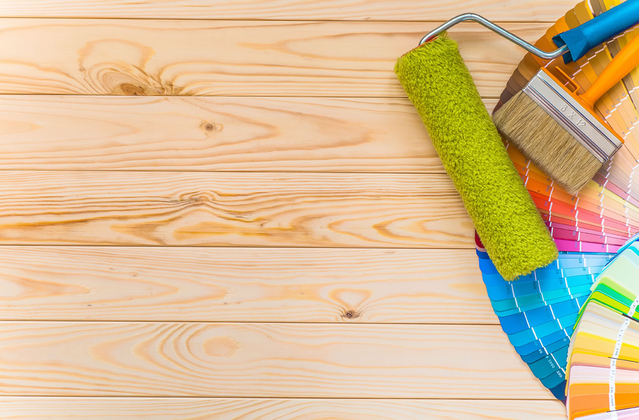
An annual event, experts at the PANTONE Color Institute predict color trends for the year ahead and declare a color of the year. In September, the PANTONE Fashion Color Report was released for spring 2017. It included a list of the top 10 colors of the season and an overview for how fashion designers would use them in their spring collections at New York Fashion Week from Feb. 9-17.
This year’s top colors are a reflection of hues found in nature. The list below includes color notes from PANTONE.
PANTONE 17-4123 Niagara
A classic, denim-like blue; comfortable and dependable; speaks to a desire for ease and relaxation; most prevalent color for spring 2017
PANTONE 13-0755 Primrose Yellow
A joyful yellow shade; sparkles with heat and vitality; transports to a destination marked by enthusiasm, good cheer and sunny days
PANTONE 19-4045 Lapis Blue
An intense blue shade imbued with an inner radiance, conveys energy, strong and confident
PANTONE 17-1462 Flame
A red-based orange, gregarious and fun loving, flamboyant and vivacious, adds a fiery heat to the spring 2017 palette
PANTONE 14-4620 Island Paradise
A cool, blue-green shade that speaks to a dream of escape; brings to mind a change of scenery, tropical settings and a desire to unwind
PANTONE 13-1404 Pale Dogwood
A quiet, peaceful pink; a subtle shade with a soft touch that infuses a healthy glow; has an aura of innocence and purity
PANTONE 15-0343 Greenery
A tangy, yellow-green hue; speaks to the need to explore, experiment and reinvent; illustrative of flourishing foliage; signals you to take a deep breath and reinvigorate
PANTONE 17-2034 Pink Yarrow
A festive, tropical shade; whimsical yet tempting and tantalizing; bold and attention getting; a stimulating color that lifts the spirits and gets the adrenaline pumping
PANTONE 18-0107 Kale
A foliage-based green that evokes thoughts of the great outdoors and a healthy lifestyle, conjures a desire to connect with nature, provides a complementary background to the more vibrant tones in the palette
PANTONE 14-1315 Hazelnut
Spring’s key neutral, brings to mind a natural earthiness, unpretentious with an inherent warmth, a transitional color that effortlessly connects the seasons
In December, PANTONE’s color experts selected Greenery as the color of the year for 2017. Referred to as “nature’s neutral,” Greenery is extremely versatile, pairing well with neutrals, bright colors, deeper shades and metallics. It can also handle the presence of 2016’s color of the year: a soothing blend of Rose Quartz (a warm rose tone) and Serenity (a cool, tranquil blue).
“Greenery bursts forth in 2017 to provide us with the reassurance we yearn for amid a tumultuous social and political environment,” Leatrice Eiseman, executive director of the Pantone Color Institute, said in a press release. “Satisfying our growing desire to rejuvenate and revitalize, Greenery symbolizes the reconnection we seek with nature, one another and a larger purpose.”
As the seasons change and we move further into 2017, consider including Greenery, or any of this year’s top colors, in your everyday fashion and beauty or home décor.


Comments