Designed by Francia Fusik, All in One Decorating Solutions
Photographed by Teran Buckner, Teran Buckner Photography
Living Room:
Stay in Shape
The details in this chandelier are a sharp contrast to the minimalist accents in the design, but the curves in its structure mimic the circular effect of the room. Focusing on one shape – whether it’s straight lines or the natural arcs in a space – can streamline the look for a traditional appeal, but contrasting the two can add a modern touch. Mixing the clean lines of a sofa or accent tables with the curves of awing-backed chair is another way to achieve this look.
In Full Bloom
Keep clutter out by adding sleek, thoughtful accessories that keep the focus on the simplicity of the space. A vase of fresh flowers can be easily changed weekly to keep the look feeling new. Here, the blooms match the white hues and the stems add a pop of color. The rounded vase gives another nod to the living room’s arches.
Fun with Fabrics
Create a feeling of texture against the neutral color palette by getting playful with fabrics. Consider including furniture with an understated pattern and add decorative pillows in a bolder print. The same effect can be achieved with accent rugs, either in a complementary color or with an added texture.
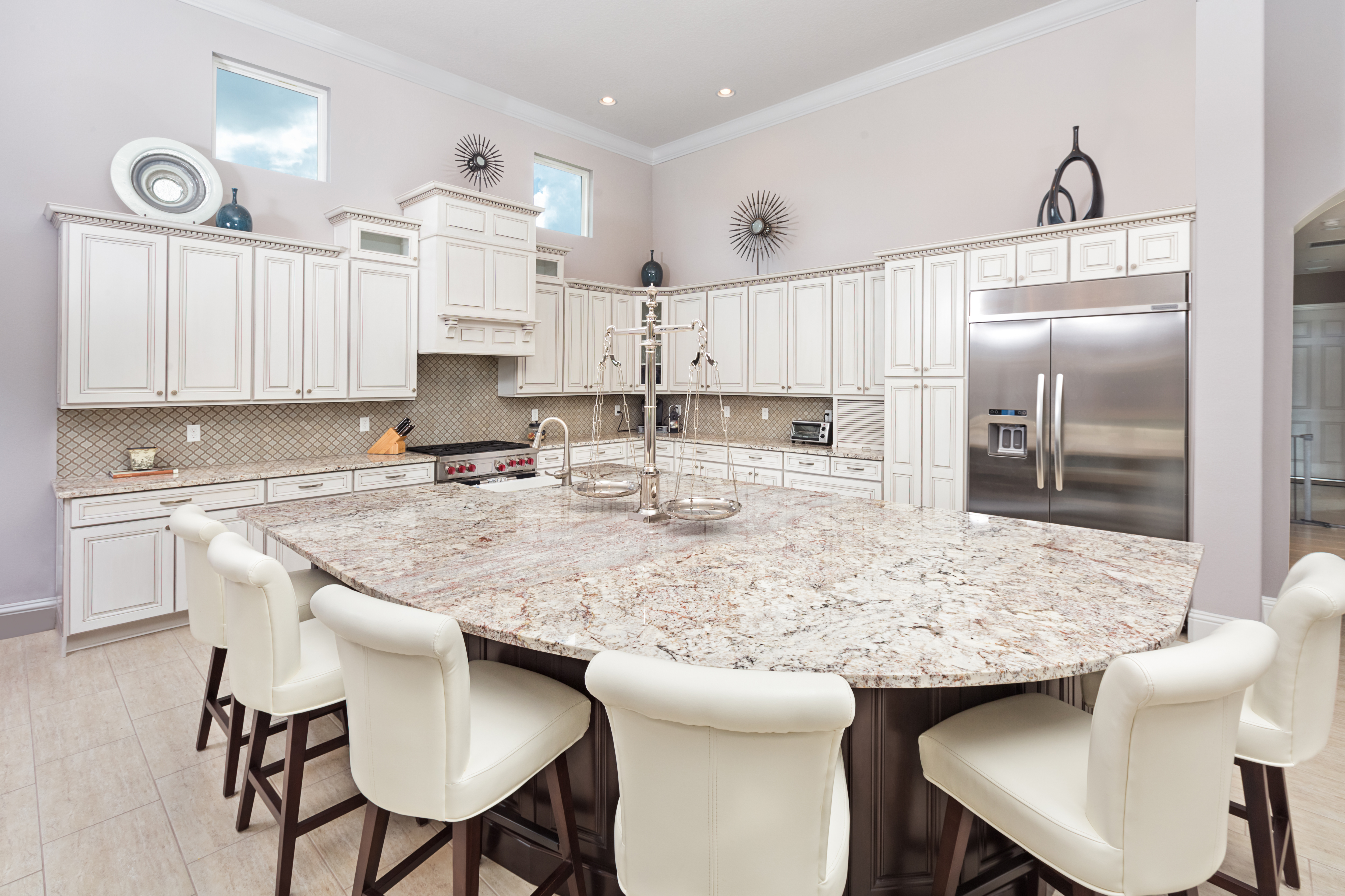
Kitchen: A Balancing Act
Balance is an essential element of any transitional design. In this mostly-white kitchen, that balance is not only achieved by the addition of dark wood paneling at the base of the island, but also by the look of the finishing touches. Stainless steel appliances, accessories and hardware on the cabinetry add a sophisticated shine while the red knobs on the stovetop provide a subtle flair.
Defining Details
Hide not-so-pretty kitchen essentials, like the hood for a stovetop, by disguising it as part of the cabinetry. This allows it to seamlessly fit into the design of the kitchen while still being fully functional. Add crown molding to the top of the cabinets for a sophisticated look.


Comments